Some data from the LT100
Nikita Bogdanov
First published: 9/21/24 | Last updated: 12/19/24
- Preamble
- Course profile
- Data
- Data sourcing and processing
- Additional avenues
- Other LT100 data projects
- Footnotes
** Since first posting this, I’ve shared the link on Reddit and have been answering questions there. I expect to keep most answers just on Reddit rather than incorporating them here, so I encourage readers to browse the thread for additional context. **
Preamble
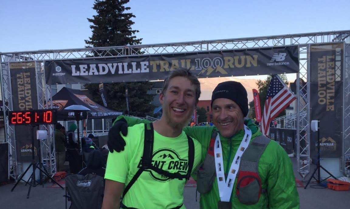
I spent the summer of 2015—and 2016, 2017, 2018, and 2019—in Leadville, CO, working as an instructor at the Colorado Outward Bound School (COBS). It was then that I first learned of the Leadville Trail 100. By the time I started at COBS, the organization had been running the Outward Bound aid station for a number of years and drew heavily from its ranks to staff the aid station and stock a pool of volunteer pacers. Having spent all summer working in the mountains, I figured I was up to the challenge of pacing, and that first year I accompanied a runner from Outward Bound to Mayqueen. In both 2016 and 2017, I was lucky enough to pace from Outward Bound to the finish. (The photo below is from 2016.)
While my course schedule didn’t align with the race in 2018 and 2019, somewhere along the way I decided that I would one day run the LT100 myself. Until recently, this was a goal without much conviction behind it: in 2018 we moved from Colorado to New York City, and with the change of scenery it was challenging to hold on to the self I had grown into while living and working in the mountains.
…until David Roche set the course record at this year’s LT100. I’m still many years away from running in the LT100 myself, but with David’s record-setting debut—and a family commitment to moving back to the Mountain West in the not-too-distant future—I wanted to reconnect with my own experiences with the race and to start taking seriously that one day it will hopefully be me coming through the Outward Bound aid station. And so I did what I’m reasonably good at doing: I pulled some historical data and played around with making some graphs.
To be clear, this data falls pretty solidly into the category that I call “data porn”—data that’s interesting to look at but that is ultimately of little or no practical utility and from which you can’t draw (m)any statistically robust conclusions. Indeed, there are plenty of websites, blogs, and Reddit threads devoted to the topic of strategizing for ultras generally and the LT100 specifically, and those looking for practical advice should most certainly turn to sources such as those. The purely curious, however, can go some way toward scratching their data itch here.
Course profile Go to top
For those interested, this profile is derived from the course in this CalTopo map.
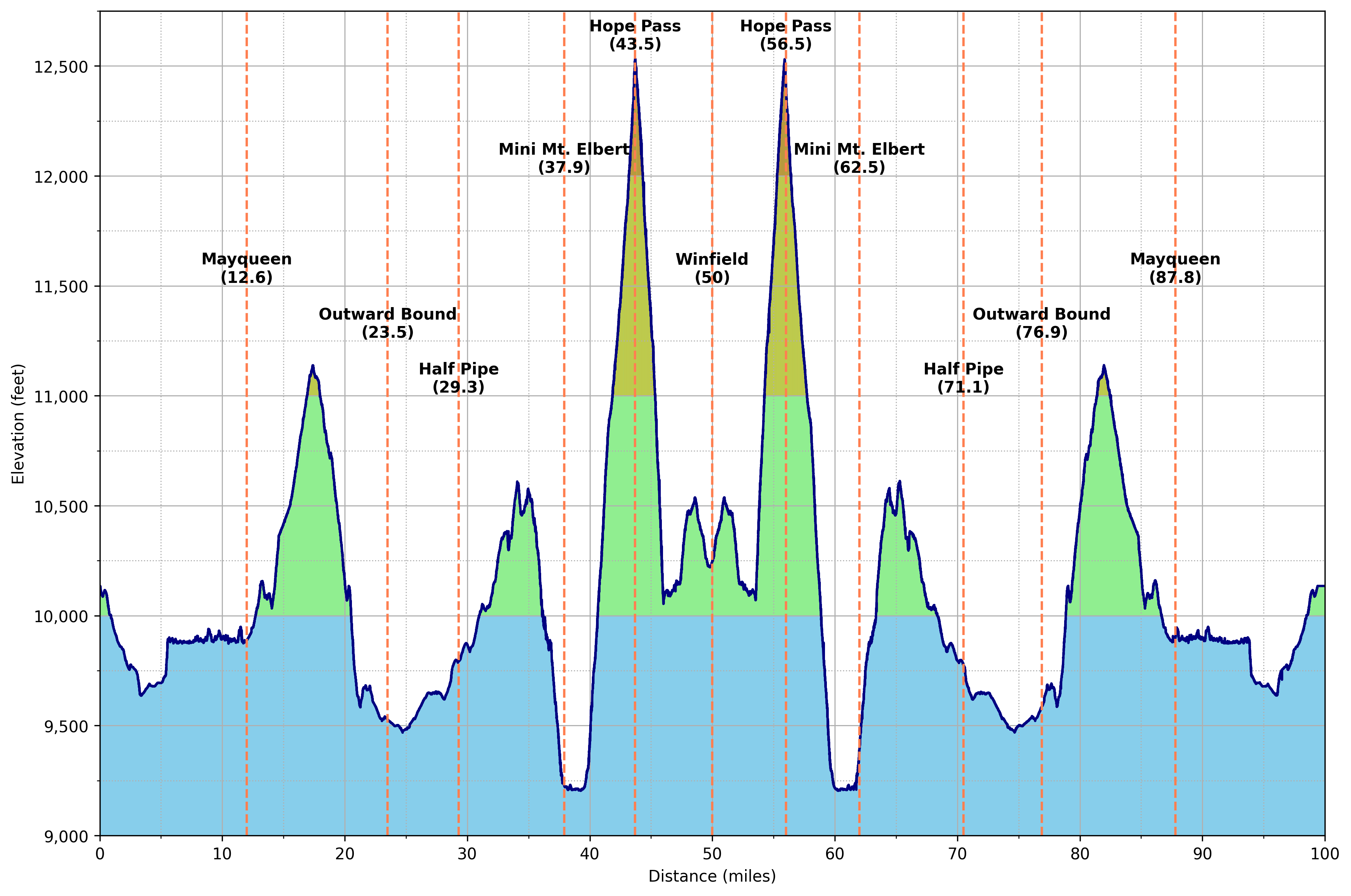
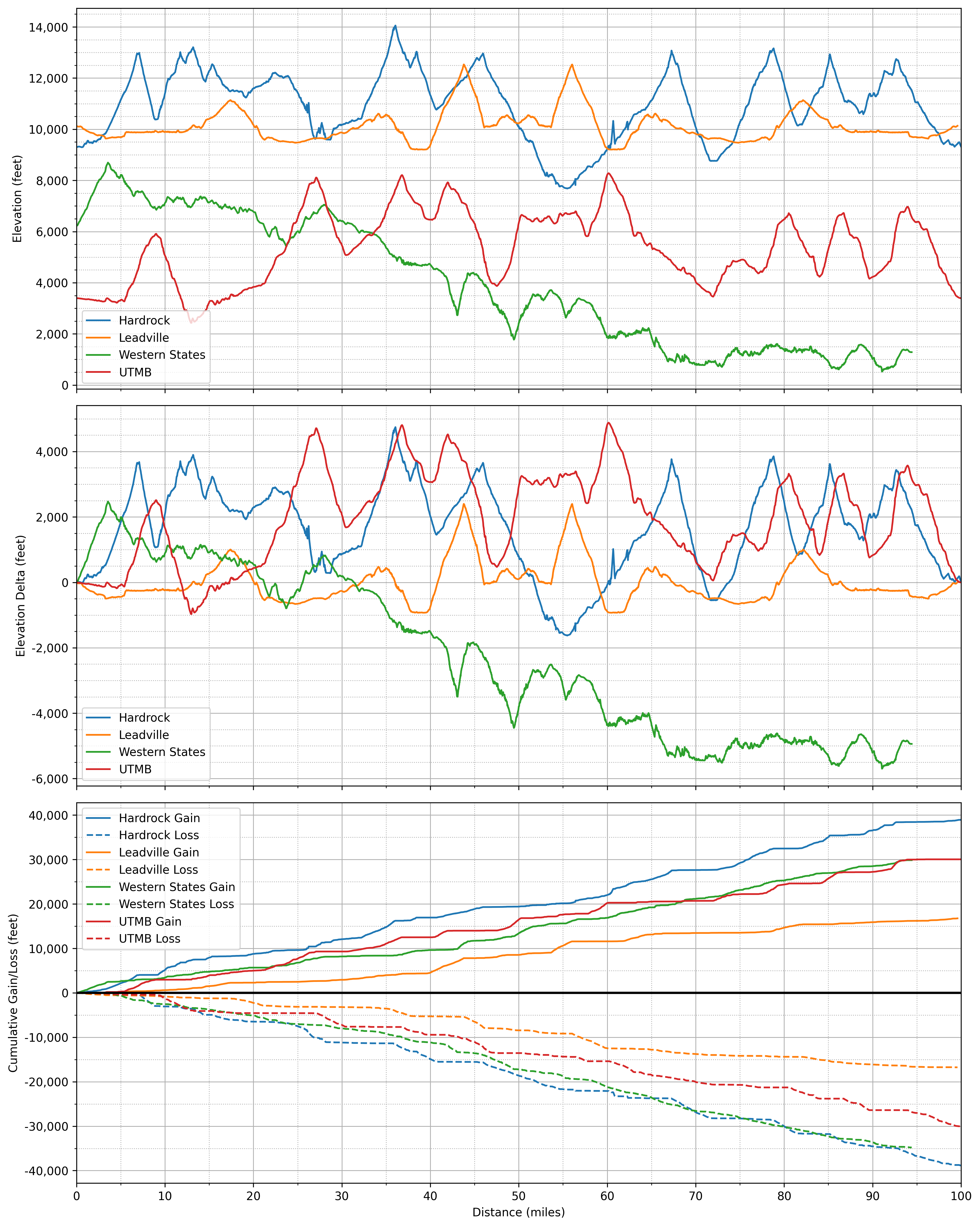
For added context, it’s interesting to compare the Leadville course to that of Hardrock (counterclockwise), Western States, and UTMB. Note that these profiles are not based on “official” course maps and so may have erroneous or outdated features—though probably are 98% accurate. Additionally, cumulative gain/loss is waypoint-to-waypoint, so almost certainly exaggerates gains and losses. E.g., Leadville shows on the order of 16k feet of gain, whereas the figure from CalTopo is just north of 15k; Hardrock shows on the order of 39k, whereas the figure from CalTopo is 35k; and ditto for Western States and UTMB. As you’ll see, this is all consistent with the theme of this writeup: lots of approximations that, despite obvious shortcomings, are in my opinion more or less fine for most purposes.
Fractals
Just above I noted that my estimates of cumulative gains and losses are based on waypoint-to-point elevation differences, and that this may result in some exaggeration. While seemingly trivial, this observation hides a deep point which is worth exploring further—namely that it is not necessarily trivial to define a trail’s “true” length. In this respect trails resemble coastlines and river networks, which are fascinating objects, mathematically.
The intuition is straightforward. Imagine your favorite jagged coastline. Now, take a ruler that is 20 feet in length and use it to measure the coastline’s length. Shrink the ruler down to 10 feet, then to five feet, then to one foot, then to one inch, etc. As your ruler shrinks, your estimate of the coastline’s length increases. As it turns out, there is a neat relationship between the size of your ruler and the measured length of the coastline, which boils down to a single number called the fractal dimension. For objects such as coastlines, the fractal dimensions varies from 1.0 to 2.0; the closer the fractal dimension is to 2.0, the more complex the boundary. (For those interested in diving deeper into this subject, I recommend as a starting point Wikipedia’s page on the so-called Coastline Paradox.) You can do something similar with river networks.
You can see where we’re going… What is a trail but a coastline or river rotated into the sky? If we can measure the fractal dimension of the coastline of England, certainly we can measure the fractal dimension of a trail’s elevation profile? It is easy to analogize trails to coastlines and river networks—and below I do derive some measures of profile complexity—but there is good cause for skepticism. Fractals manifest where we have scale-invariant self-similarity, but unlike coastlines and river networks, elevation profiles are not self-similar. Unlike coastlines and river networks, which develop naturally, elevation profiles follow man-made trails that have been designed, among other things, to incorporate switchbacks and avoid cliffs. In other words, coastlines, river networks, heads of romanesco, tree branches—all of these look roughly the same whether you’re zoomed in close or looking from afar. We can’t say the same for an elevation profile.1
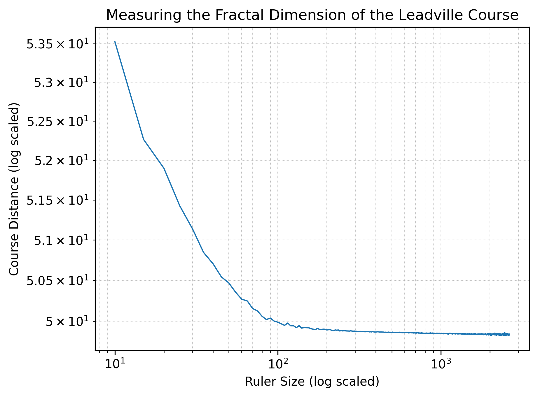
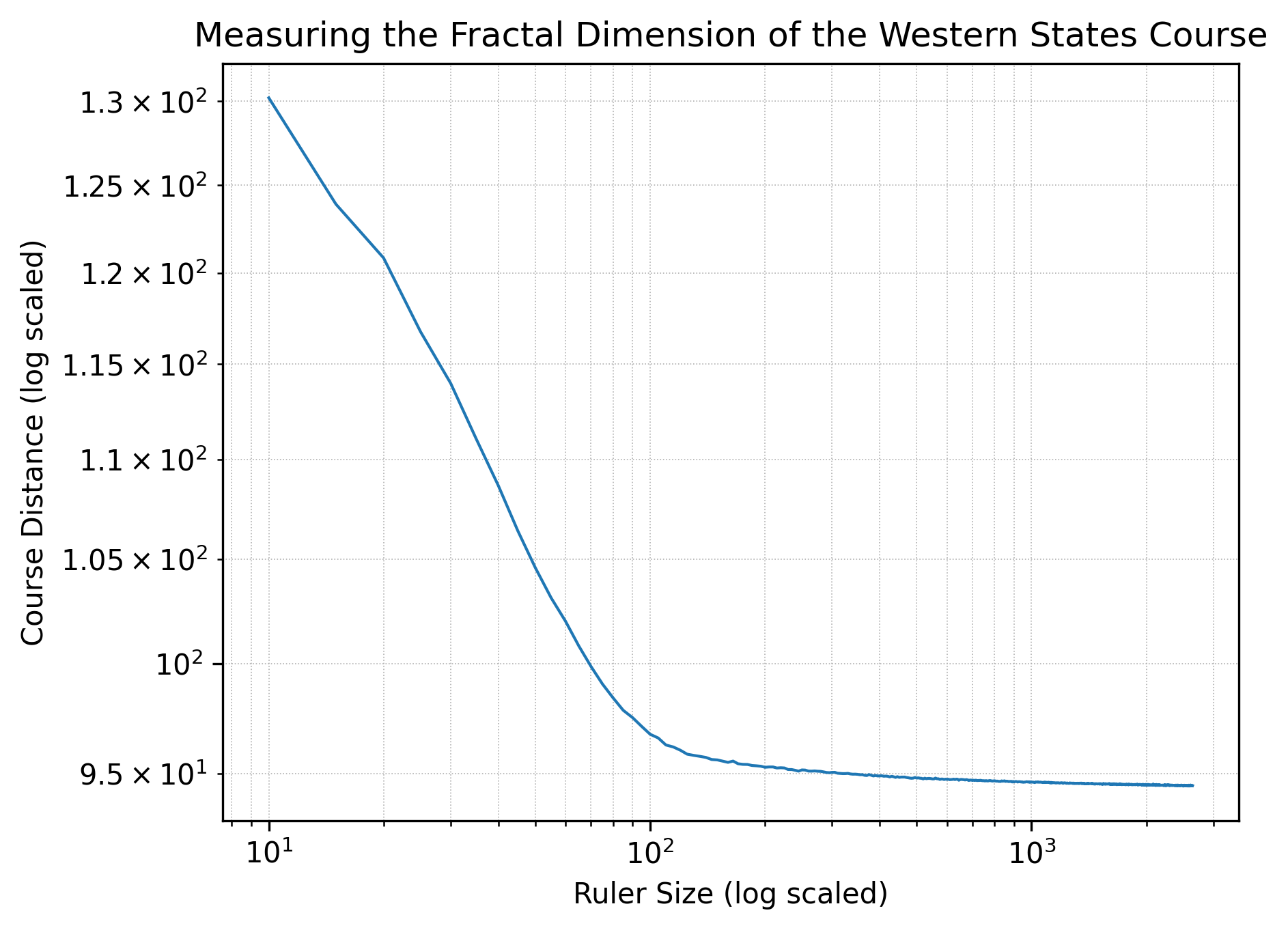
Nonetheless, we can still visualize how a trail’s length varies with the size of the ruler we use. The charts below shows trail length as a function of ruler length for ruler lengths between 10 feet and 2,640 feet (half a mile), measured every five feet.2 For each course, we can characterize the curve by its slope in the first linear regime, more on which below.
Taking Leadville first, we see a slope of \(d=-0.029\) in the regime from 10 feet to 85 feet.
The same view for Western States yields a slope of \(d=-0.139\) in the regime from 10 feet to 95 feet.
For Hardrock, the slope is \(d=-0.074\) in the linear regime from 10 feet to 75 feet, roughly in between Leadville and Western States.
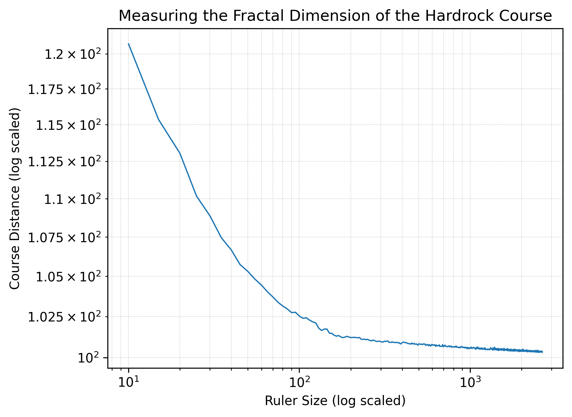
Notably, each plot has two distinct regimes: at ruler lengths of less than 100 feet, the courses evidence fractal-like behavior; at greater ruler lengths, however, the courses behave much more like straight lines. All that said, it’s quite possible that the uncertainty in elevation gives a false sense of accuracy at shorter ruler lengths, in which case the fractal-like behavior is just an artifact of low-resolution data. (Elevation data for each of the roughly 52,000 waypoints per course is from the National Map.) Indeed, there is likely something funny going on here: runners function as rulers with lengths on the order of an average stride length, so three to four feet; thus, according to the plot for Leadville, a runner’s GPS watch should register the course as being roughly 107 miles, but a runner’s GPS watch in fact registers it as right around 100 miles.
Assuming that there is some substance in the plots above—that we’re seeing more than just artifacts—what does all of this mean for a runner’s experience on trail? Well, take Western States as an example. The shortest measured distance is 94.45 miles, while the longest measured distance is 130.20 miles, a difference of over 35 miles. At human scales of rulers, the difference in measured distances is surely much smaller—but if we raced humans against giants, there would be serious fairness concerns: depending on their stride length the giants could shave more than 35 miles off of the course!
More realistically, slope tells us something about the average local hilliness of a course. The more locally hilly—the more small ups and downs—the more changing ruler sizes will make a difference and the greater the slope we’ll see. In other words, it looks like both Western States and Hardrock are, comparatively, rather more hilly than Leadville. If anyone has run Leadville and one of Western States or Hardrock, I’d be very curious to hear whether this assessment holds up in real life. Likewise, if you have any expertise in fractals specifically or mathematics generally and see a glaring issue, please do let me know; my contact information is in the footer. I think I know up from down, but at the end of the day I’m just an amateur enthusiast.
One final note on this subject: if we’re after measures of hilliness, there are certainly better ones out there. Off the top of my head, we could look at average uphill/downhill grades, grade standard deviations, the number of times you switch from going up to going down, etc.
Data Go to top
Below, I’ve put together a collection of data cuts that I think are interesting and that I hope others find reasonably interesting as well. That said, if you’d like to see a cut that I haven’t looked at, let me know and I’ll see if: 1) the data structure will support it; and 2) I have the time to do it. Feel free to let me know, too, if you see anything wrong, confusing, or otherwise worth taking another look at. My contact information is below, in the footer.
The Basics
The Leadville Trail 100 started in 1983 with 10 finishers; in 2024, it had just over 400.3 That’s a 40x increase in finishers in roughly as many years—and assuming the DNF rate has remained approximately constant, which I think is likely, ditto for the number of entrants. But the race’s growth trajectory has been far from steady, with just two periods of rapid growth: 1) 1987-1988, which brought participation to levels that lasted through 2008; and 2) 2009-2010, which brought participation to modern-day levels. What happened in 2009 and 2010? These years follow on the heels of the financial crisis, so it’s possible that recently unemployed bankers took up ultra running; much more salient, however, is that on May 5th, 2009, Christopher McDougall published Born to Run.
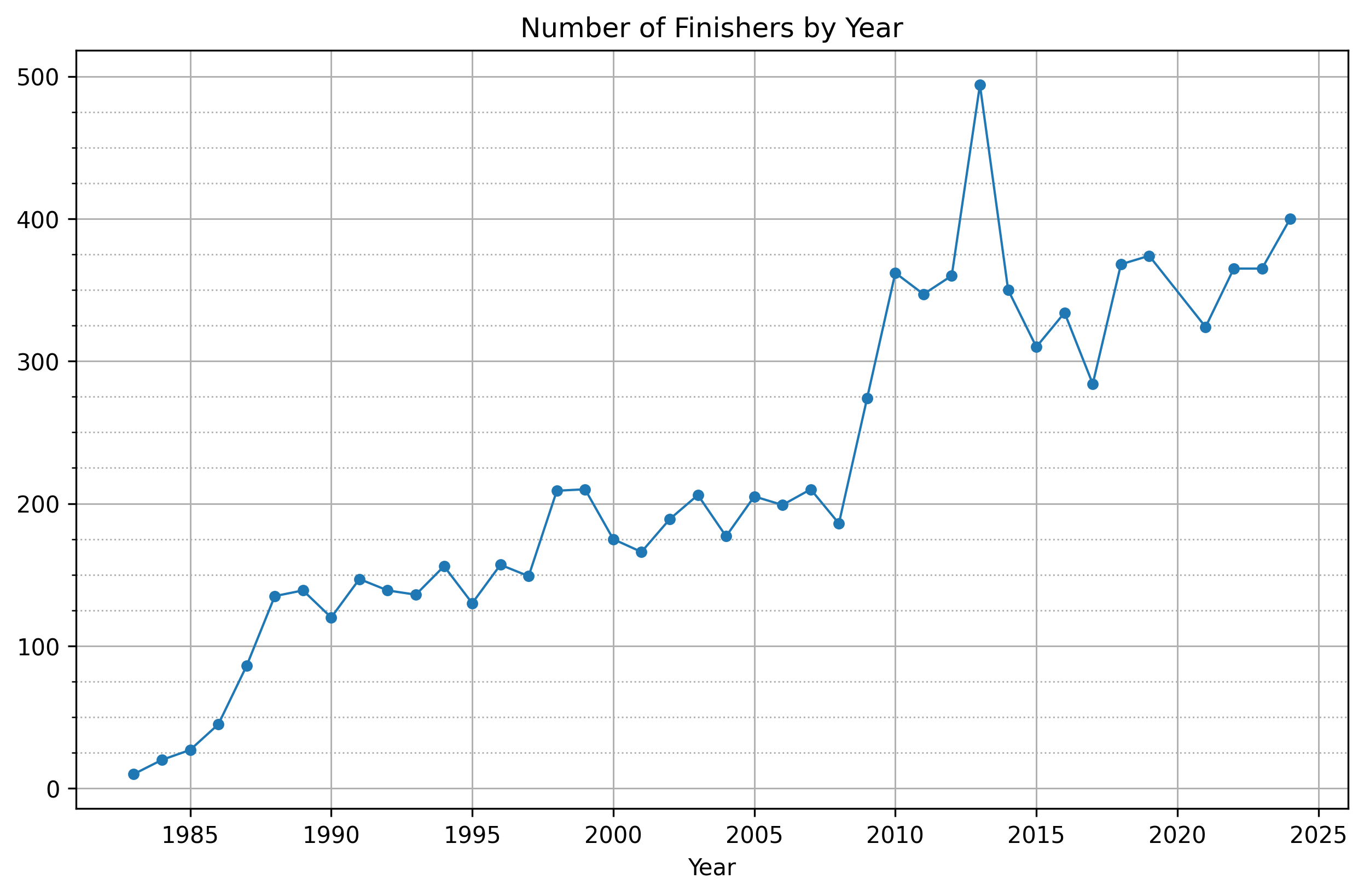
This is backed up to a degree by Google Search Trends data, according to which the monthly all-time high for Google searches for “leadville trail 100” was in August 2009. (Note that it was not in May of that year, the month Born to Run was published.) Google Search Trends also shows, not surprisingly, that the race’s search relevance peaks on a predictable yearly cycle, with August of each year witnessing a sharp spike and the rest of the year showing little if any engagement. It’s interesting to see that the race’s search popularity in the oughts was higher than it is currently; perhaps we’re seeing here the influence of social media, or else a change in how people use the google search bar, or maybe something else entirely. (The graph for “leadville” is fairly similar, with August of 2009 being the all-time high month and popularity following a predictable yearly pattern.)
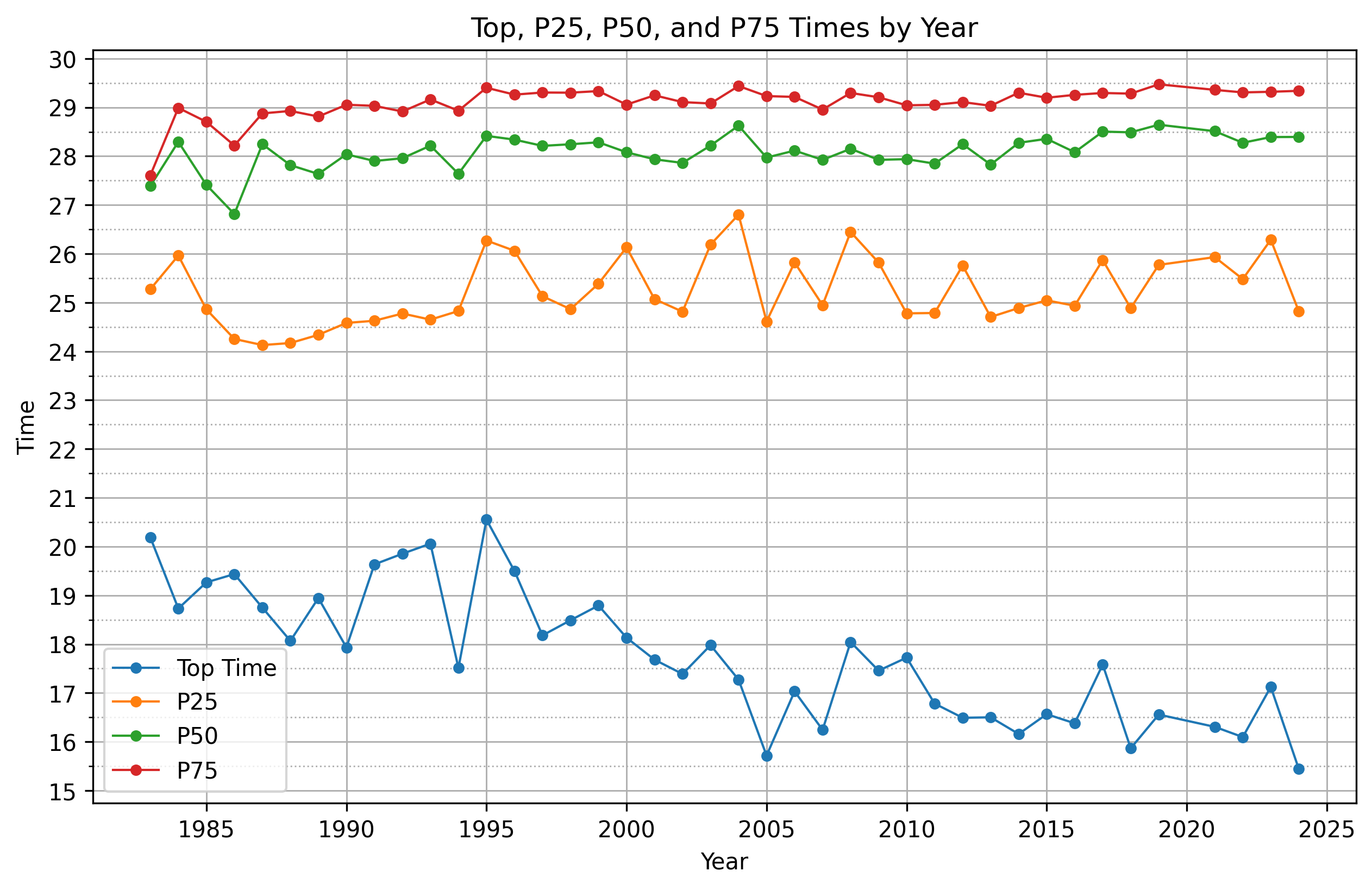
On their SWAP Podcast, David and Megan Roche often say that we’re in the middle of a performance revolution in endurance sports, powered by high-carb fueling, with top times getting faster across a variety of events. Without saying anything about causation—because there are too many confounding variables to list—it’s anecdotally interesting that we see this phenomenon in the LT100, but only among top finishers. For most everyone else, even the top 25th percentile, finishing times have remained roughly flat across the years.
That said, my guess is that Leadville attracts a lot of first-time ultra runners, and newer ultra runners may not be benefitting as much from the fueling revolution as experienced ones. As I suggest below, what I would really like to do is control more for experience. E.g., maybe you look only at runners who have completed Leadville before—or at those with at least one other mountain ultra under their belt. Or, maybe you look to a different race entirely. David Roche has suggested that the Leadville course record was commonly thought to be “soft,” so to control more for experience you could look to a course where the record is thought to be “hard.”
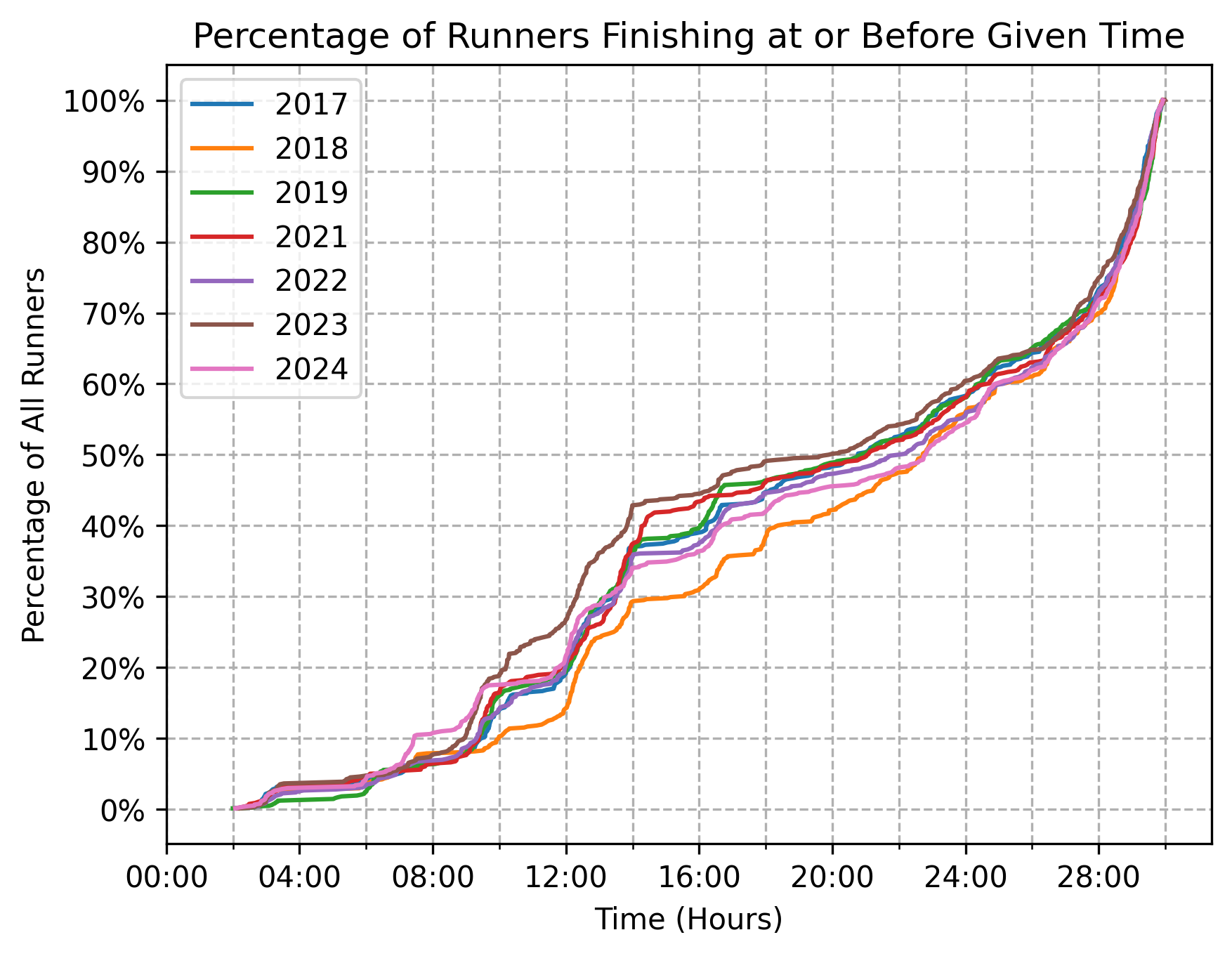
Cumulative percentages
The vast majority of DNFs take place prior to the 18-hour mark, meaning that by the time the first runner crosses the finish line, the roster of finishers-to-be is more or less set. Roughly, and all else being equal, if you make it past hour 18, odds are that you’re not going to DNF.
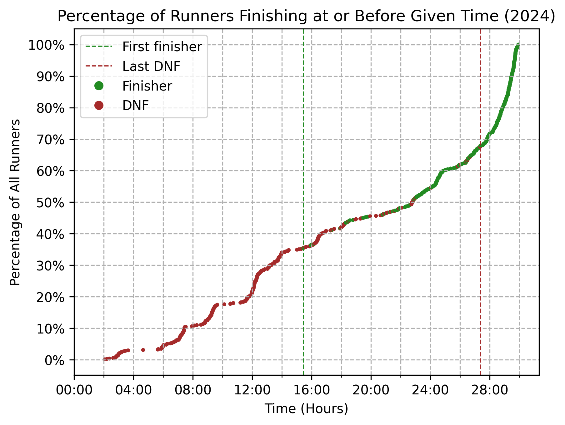
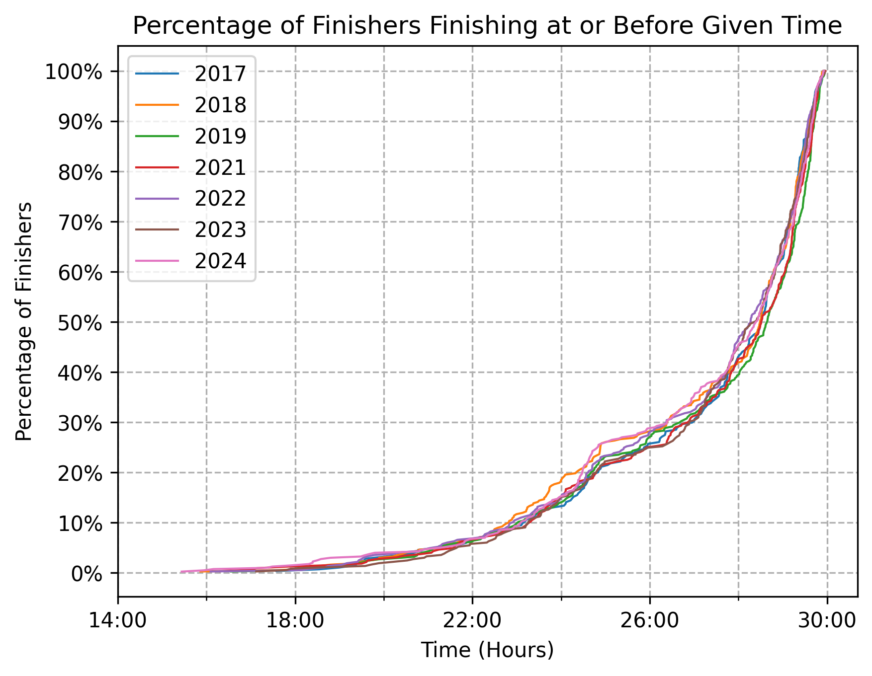
Zooming into just those who finished the race, we can see that the median finishing time in 2024 was just north of 28:00. By the 24-hour mark, only about 15% of finishers had come through.
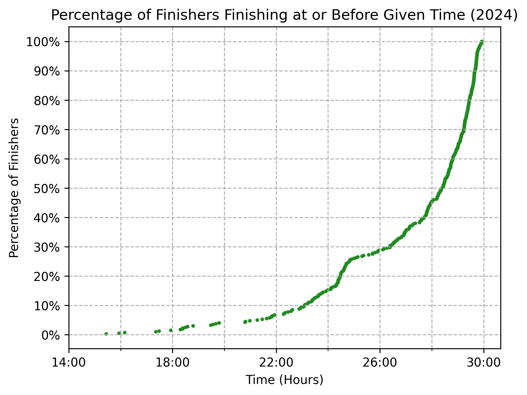
The percentages vary slightly from year to year, but as a whole the shapes of both curves—all runners and finishers only—are surprisingly durable.
What’s especially stunning in the chart below is the durability of the inflection point around the 25-hour mark. The rate at which runners cross the finish line in the few hours before the 25-hour mark is qualitatively quite different than the rate at which runners cross the finish line in the few hours after the 25-hour mark. For one reason or another, if you’re not finishing ahead of the 25-hour mark, you’re finishing (at least) a few hours after it.
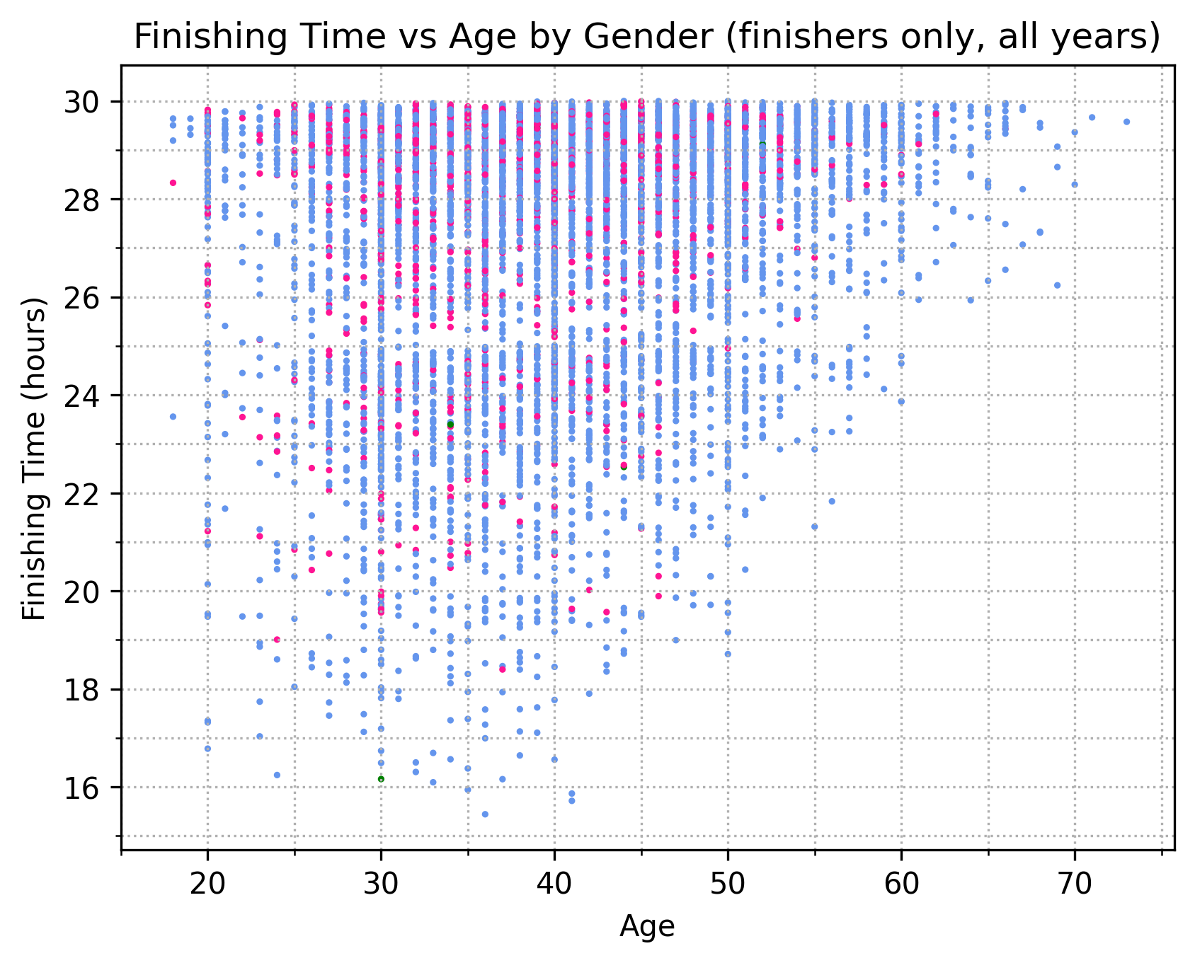
Age, gender, and time
Outside of the observation that older runners tend to be slower, there’s not much of interest when we break down finishing times by age and gender. But, this graph does reinforce the oddity I pointed out just above, about the 25-hour mark being a sort of inflection point. Here, the inflection manifests as a decrease in “dot density” in the band between 25:00 and 26:00.
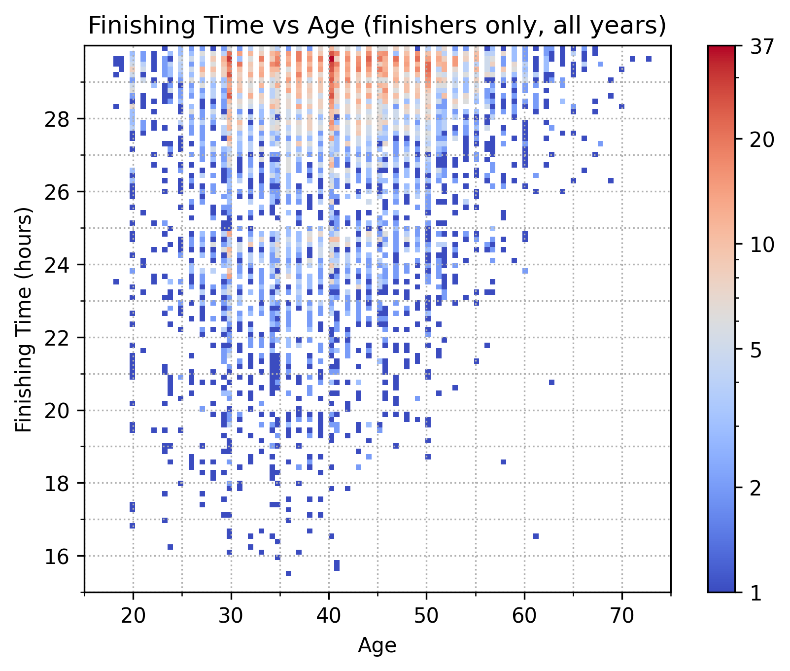
Because many points overlap, it’s also instructive to look at a heatmap version of this same data—though with the gender dimension now collapsed. Note that the color scale is logarithmic to account for the large differences in bin counts.
Splits and pace
For 2019 through 2024, we can also look at performance within splits—i.e., in between aid stations.4 Here, we’re looking at box and whisker plots of pace data by split.5 So, e.g., in 2019 the median pace of finishers on the start-to-12.6-mile split was 10:37.
A few features stand out to me.
- First, there’s not much year-to-year variation in either the overall shape or the spreads of individual splits.
- Second, Hope Pass is brutal in both directions, but more so on the way out than on the way back. How so? Runners consistently move slowest on the portion of trail from mile 38 or so to mile 43.5, which corresponds to the outbound uphill portion of Hope Pass; the stretch from mile 50 to mile 56.6, where runners head up the backside of the pass, has the second-slowest pace.
- Third, uphills bring out performance differences. The interquartile range (IQR) of the four splits leading up to Hope Pass hovers roughly between 2:00 and 2:30. I’ve heard Leadville described as a road race for the first 40 miles, and this data goes some way towards supporting that characterization. Once runners begin to ascend, however, the IQR widens to nearly 5:00 and we see the spread increase as well between the Q3 and the upper fence and Q1 and the lower fence.
- Fourth, we can see Hope Pass reflected in every split that follows. The IQR of the last four splits, which runners hit once they descend Hope Pass, hovers around 3:00, a 25% to 50% increase compared to the IQR of the first four splits.
The companion view to split paces is a view of how the cumulative pace evolves over time. What’s notable here is that as the race progresses the bulk of the pack slows down markedly if not substantially more than do the fastest runners.6 Take 2019 as an example. The median pace in the first 12.6 miles was 10:37; across 87.8 miles, it had slowed down by 6:19 (59.5%) to 16:56. By contrast, the lower-fence pace in the first 12.6 miles was 7:39; across 87.8 miles, it had slowed down only 3:45 (49%), to 11:24.
We can also look at splits from the angle of DNFs. Below, we chart out the overall DNF rate (top subplot) and the split-to-split DNF rate (bottom subplot) as a function of aid station. The observant reader will notice that the DNF rate does not decrease monotonically, which is a result of dirty data, discussed in the next section.
The bottom subplot shows the number of runners who DNF’d between aid station A and B as a percentage of the number of runners still active at aid station A. E.g., in 2019 nearly 20% of the runners who were still active at 56.5 miles had DNF’d by the time they came into mile 62.5. While I would have expected this chart to have less year-to-year variation, it’s at least not surprising to see that the highest split-to-split DNF rates occur at miles 43.5, 50, 56.5, and 62.5—i.e., in the stretch of trail seven miles before and 12 miles after the half-way turnaround and Hope Pass.
Finally, we can take a closer look at what happens on the trail by examining how often runners change ranks, i.e., pass each other. The table below examines finisher-only split-to-split rank differences from 2019 through 2024. As column four indicates, north of 90% of runners are passing someone or being passed each and every split. In general, the movement isn’t large, with runner ranks changing on average between nine and 23 places. Perhaps somewhat surprisingly, there is substantial movement in ranks all the way up through the final split.7 (Note that on small screens the table scrolls.)
| Split #1 | Split #2 | Avg. changers per year | Avg. pct changers per year | Avg. places changed | Greatest jump | Greatest fall | Spearman rank corr. |
|---|---|---|---|---|---|---|---|
| 12.6mi | 23.5mi | 337.8 | 0.973 | 23.3 | 125 | -180 | 0.951 |
| 23.5mi | 29.3mi | 329.6 | 0.954 | 13.0 | 79 | -81 | 0.986 |
| 29.3mi | 37.9mi | 340.0 | 0.963 | 11.9 | 212 | -158 | 0.985 |
| 37.9mi | 43.5mi | 344.6 | 0.967 | 17.4 | 78 | -196 | 0.971 |
| 43.5mi | 50mi | 335.6 | 0.937 | 9.6 | 70 | -141 | 0.991 |
| 50mi | 56.5mi | 338.6 | 0.954 | 12.2 | 61 | -93 | 0.987 |
| 56.5mi | 62.5mi | 330.0 | 0.949 | 12.0 | 68 | -88 | 0.987 |
| 62.5mi | 71.1/70.3mi | 322.4 | 0.946 | 12.6 | 77 | -138 | 0.985 |
| 71.1/70.3mi | 76.9/76.2mi | 321.6 | 0.937 | 9.2 | 59 | -119 | 0.992 |
| 76.9/76.2mi | 87.8/87.4mi | 337.8 | 0.960 | 14.3 | 86 | -176 | 0.979 |
Data sources and processing Go to top
All data is derived from Athlinks. Surprisingly, the source data is quite dirty. A non-exhaustive list of issues includes:
- Some runners have age = 0
- Some finishing times are under 13 hours but attached to runners who are marked as having finished rather than DNF’d
- Within a single year and filtering to just finishers, there are aid stations later on in the race that have more runners than some aid stations earlier on in the race
Additionally, DNF’d runners who finish after the cut-off time do not appear in the data at all. This is annoying and unfortunate, but the effect on the data in most if not all of the charts above is likely negligible.
A more comprehensive approach would combine the data on Athlinks (2017-2024; 1999-2001) with data from the Leadville Race Series website (1983-1986; 2002-2011), ultrarunning.com (1987-1998), raceresult.com (2012-2013), and chronotrack.com (2014-2016). While creating a centralized and standardized repository of this sort is a worthy goal, doing so requires more time than I have. Given the scale of the Leadville Race Series, however, I am a little surprised at just how disorganized data from the event is.
Additional avenues Go to top
If there were more hours in a day, I’d want to play around with:
- Comparing DNF distributions to finisher distributions by age and gender. E.g., are older runners more likely to DNF?
- Identifying runners across multiple races and tracking their performance across the years. One simple but error-prone way of doing this: match on name, home state, and (expected) age.
- Pulling data publicly available on Strava to look at heart rates during the race. E.g., if your average HR exceeds 150 in the first 12.6 miles, are you almost guaranteed to DNF?
- Again using Strava, looking for relationships between training volume, intensity, elevation, etc. and race-day performance. This is starting to border on real research, for which I’m not especially well qualified.
Other LT100 data projects Go to top
A quick Google search shows a few similar projects, linked below. If you know of any others, feel free to reach out; my contact information is in the footer.
- LEADVILLE 100: What It Takes To Finish (from COROS)
- ltracepredictor.com
- lt100analysis.com
- mitchleblanc.com
Footnotes Go to top
-
But, it turns out that we can say the same thing for ridgelines! See here for an interesting 2019 paper on this. Lay reporting on this paper is available here. ↩
-
I’ve resampled the courses so that waypoints are roughly 10 feet apart as measured along a geodesic. (I used different course profiles to create the cumulative loss/gain chart, as waypoint-to-waypoint cumulative loss/gain on waypoints spaced 10 feet would overexeggerate substantially.) Note, however, that geodesic distance is not the same as Euclidean distance, which is what we’re after here. Indeed, the length of the ruler—i.e., the Euclidean distance—between any two points \(p_1(x, y)\) and \(p_2(x, y)\), where \(x\) is the geodesic from the starting point and \(y\) is the elevation, is \(d = \sqrt{(x_1 - x_2)^2 + (y_1 - y_2)^2}\). A shorter distance between waypoints would in principle lead to a more accurate measurement of the fractal dimension, but at some point uncertainty in elevation data will stall out any improvement that would otherwise be gained from finer and finer waypoint placements. ↩
-
We’re limited to looking at finishers rather than entrants because Athlinks does not have split data prior to 2017—since outside of 2017 to 2024 and 1999 to 2001, Athlinks was not the time keeper for the race. (And for 1999, 2000, and 2001, Athlinks does not have split data.) This means that all we get for 1983 to 2016 is a list of finishers. ↩
-
Technically splits data goes back to 2017, but 2017 and 2018 data is messy, so I’ve chosen to exclude it from these views. ↩
-
The lower and upper fences are positioned at ± 1.5x the interquartile range (75th percentile - 25 percentile). ↩
-
This assumes—I think reasonably—that whatever passing goes on does not materially affect where a runner is relative to the rest of the pack. E.g., this assumes that the runners we identified as fast and median at 12.8 miles are roughly still near the lower fence and the median at mile 87.8. ↩
-
There is undoubtedly some noise in these figures—e.g., I find it unlikely that someone jumped 351 places—but they should be correct at least directionally. ↩